SignWise
Tools: Balsamiq, Adobe XD
Duration: 1 month
Focus: iOS Human Interface & Android Material Design
Context
As part of the CareerFoundry coursework, I was asked to create a mobile-first app of my choosing, apply styling to the screens based on iOS Human Interface and Material Design guidelines, and conduct usability tests to improve the design.
Objective
This app aims to make learning ASL easier by utilizing a spaced repetition system (SRS) that tests users based on whether they answered correctly. It also incorporates a dictionary function so that users can access specific signs as needed, and a camera function for users to see themselves while practicing.
Currently, there are several ASL apps on the market such as Lingvano, ASL Sign Language Pocket Sign, and so on. Most of them have a rating of 4 stars or less in the Apple App Store, indicating that they are either not optimized for iOS or that they do not meet user needs.
Other ASL apps, and language apps in general, tend to leave users with too much new material and not enough review. This app aims to break the onboarding of new signs into smaller portions by testing users frequently on what they just learned.
User Flows
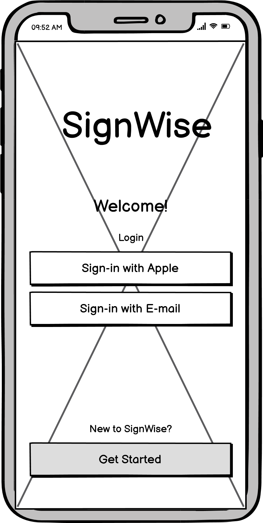
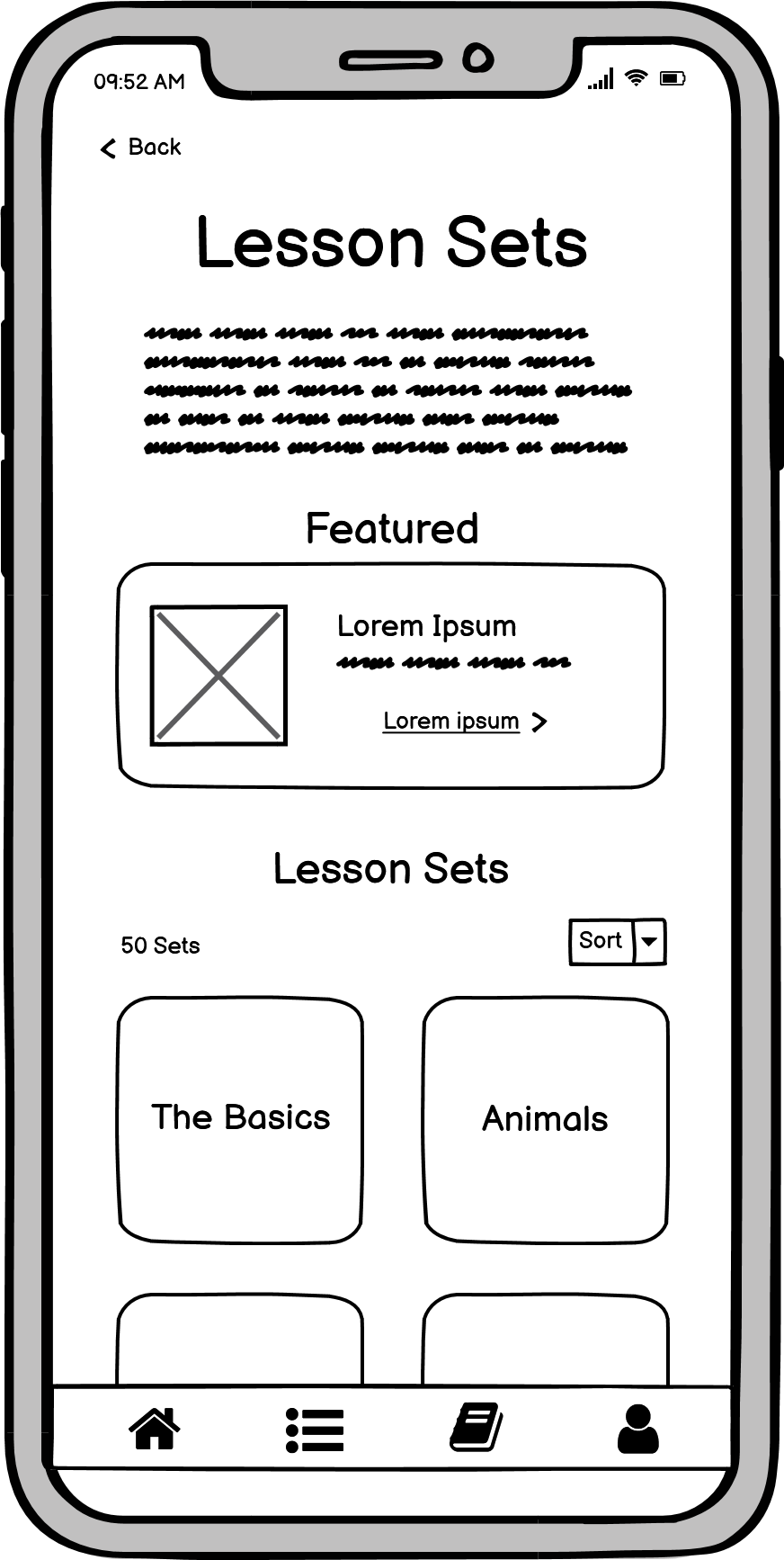
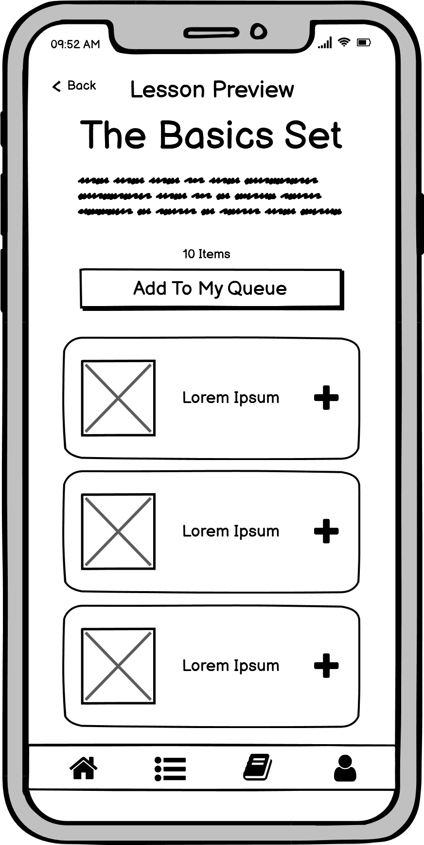
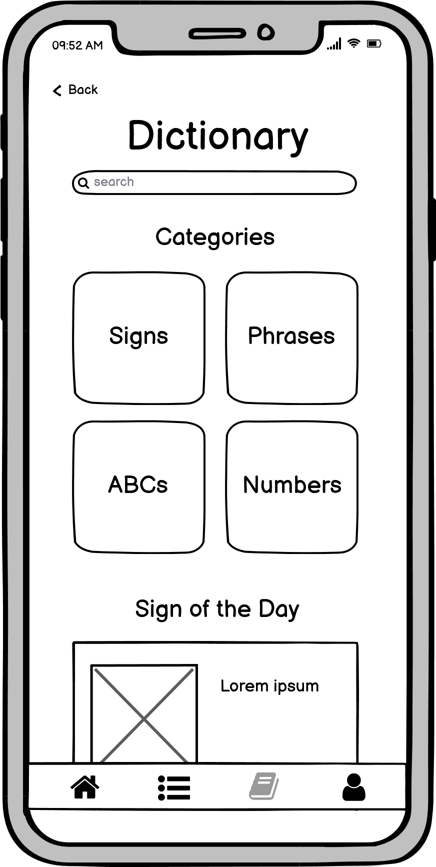
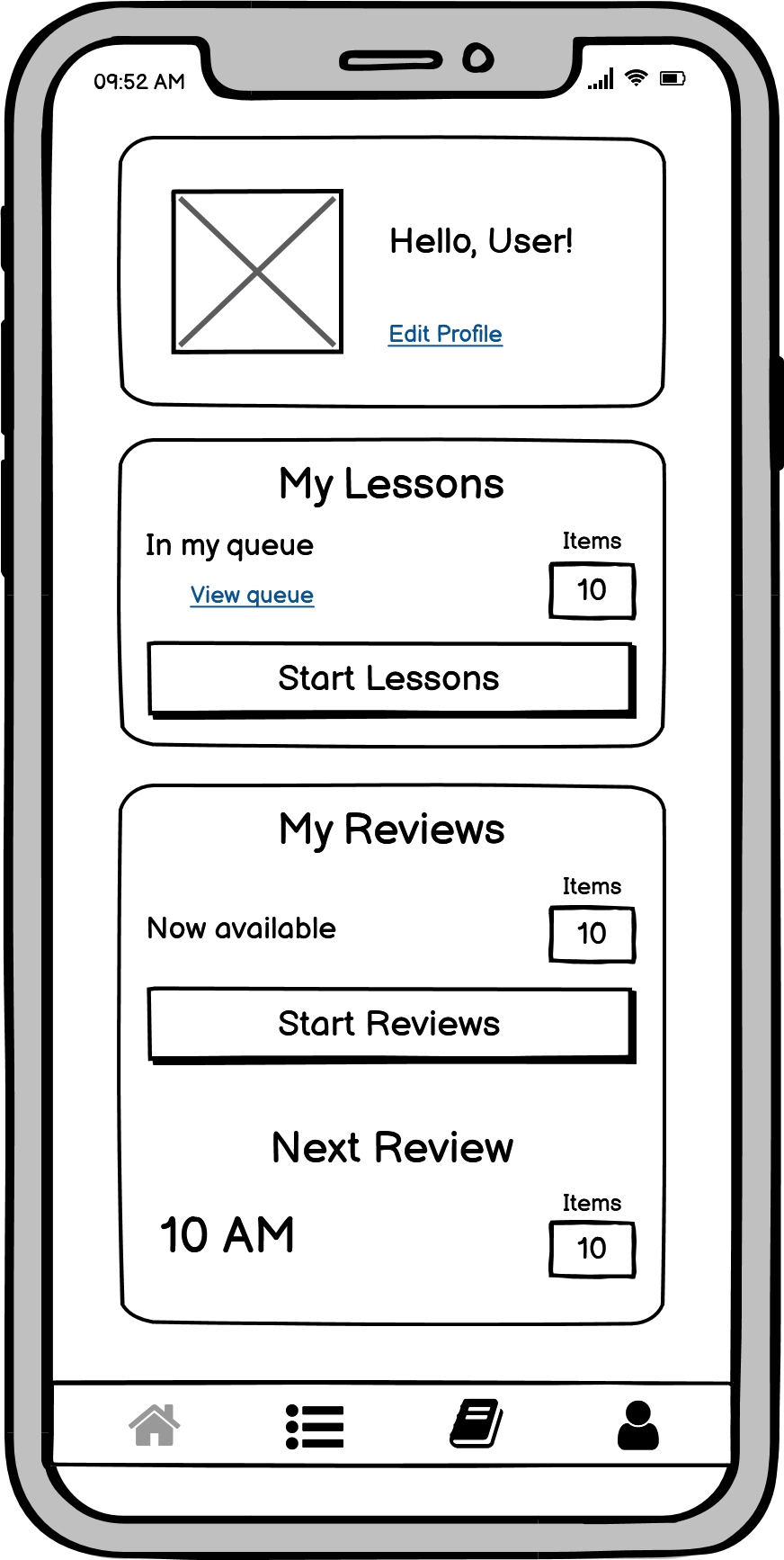
These initial user flows defined the top three user goals and mapped the screens that users would have to go through to accomplish those goals. These separate user flows were combined into the user flow diagram to represent how each individual flow feeds into the whole system. I used Balsamiq to quickly create these early sketches, then I later used Adobe XD to make low-, mid-, and high-fidelity wireframes with native text and element styling.
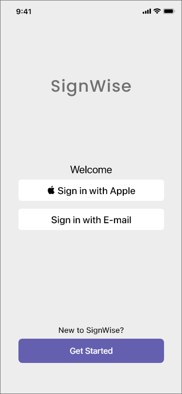
User Flow 1 - Login and Lesson Set Preview

User Flow 2 - Adding Phrase From Dictionary To Lesson Queue

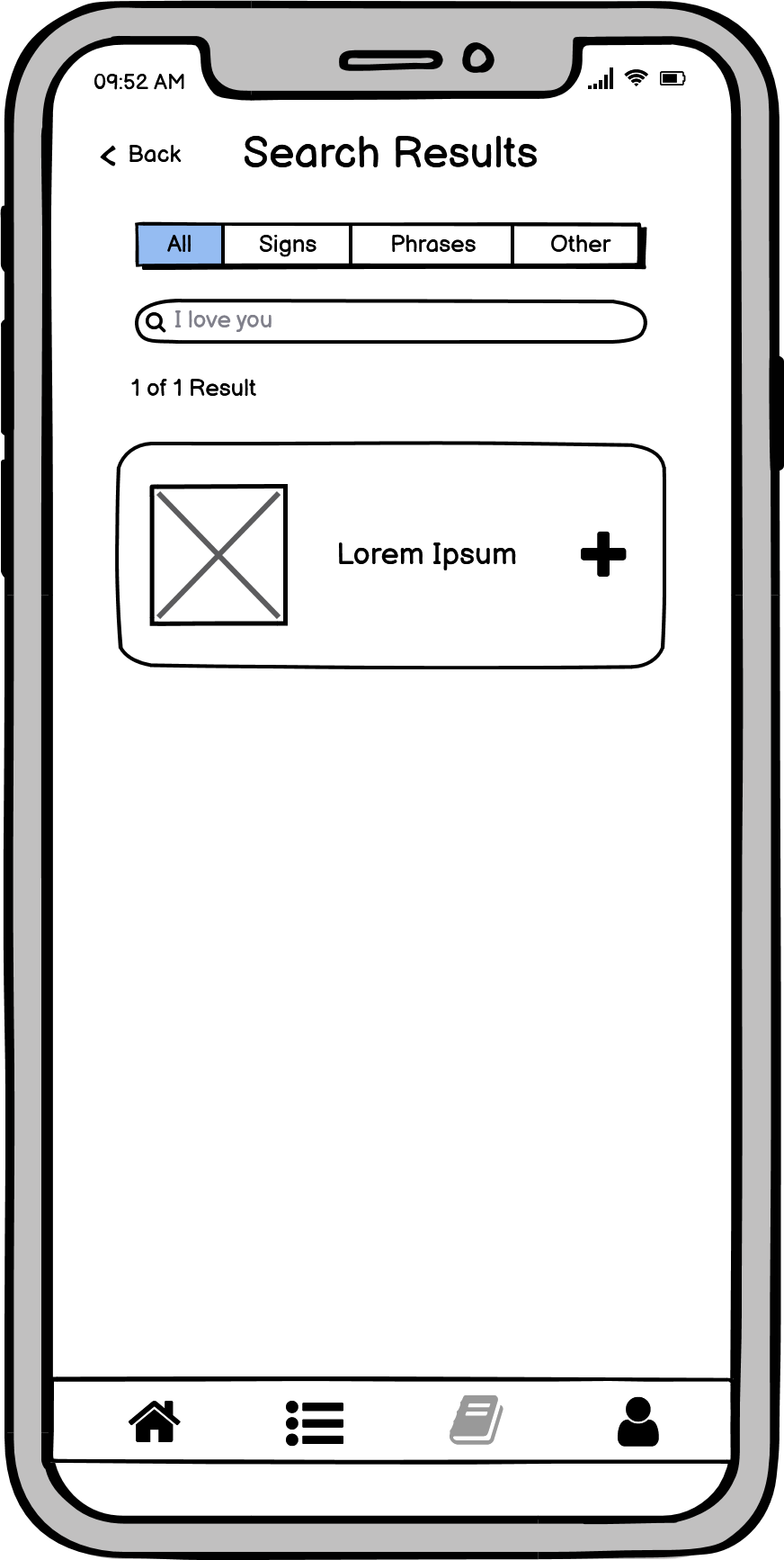
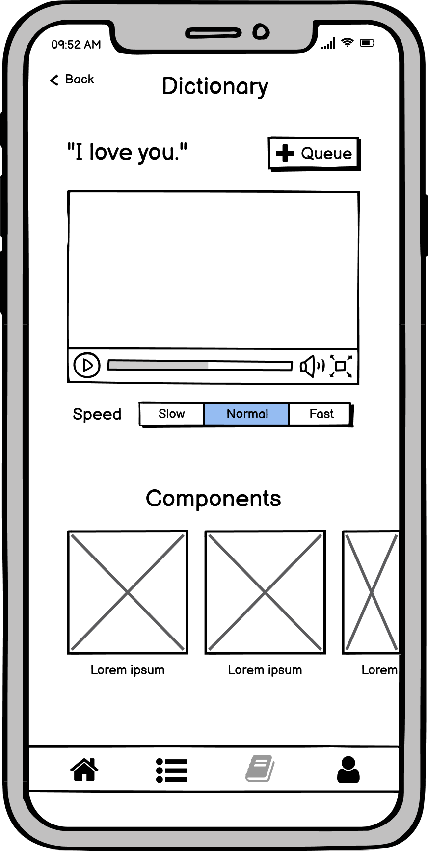
User Flow 3 - Study Items In Lesson Queue


Wireframes
I started with low-fidelity wireframes which focused on the viability of my initial sketches as a solution to the users' problems. Refined aesthetic details such as color or typography can be distracting at this stage, so they were purposefully set aside to focus on designing effective solutions.
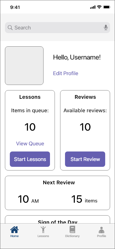
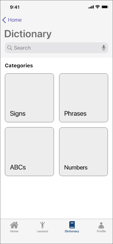
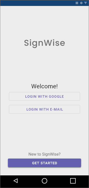
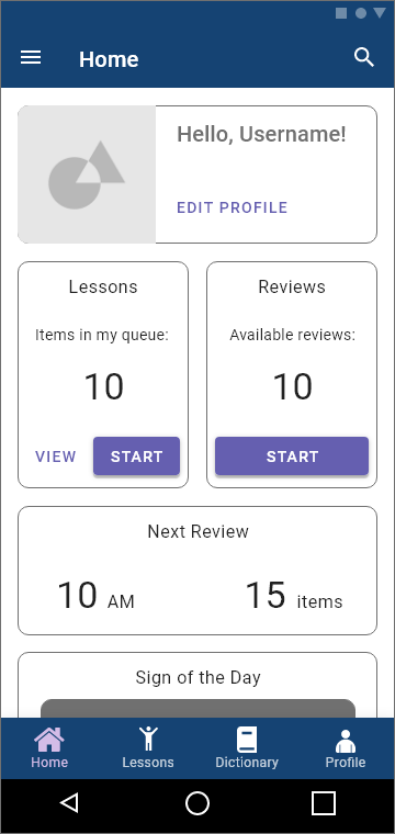
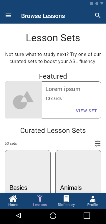
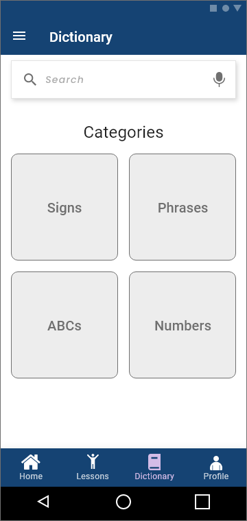
Once satisfied, I began to incorporate typography and color, as well as native UI elements to transform the low-fidelity designs into mid- and high-fidelity wireframes. I used the iOS Human Interface Guidelines to create iOS wireframes first, then adapted those screens for Android in accordance with Material Design standards.
iOS Mid-fidelity Wireframes

Android Mid-fidelity Wireframes
User Feedback
During usability testing, there were a few issues that users brought up.
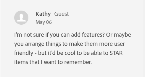
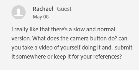
In particular, users felt the camera function was unclear, and they wanted to favorite items to view later.


In response to their feedback, I made adjustments to make the app easier to understand.
Version 1 - Before Feedback


Version 2 - After Feedback
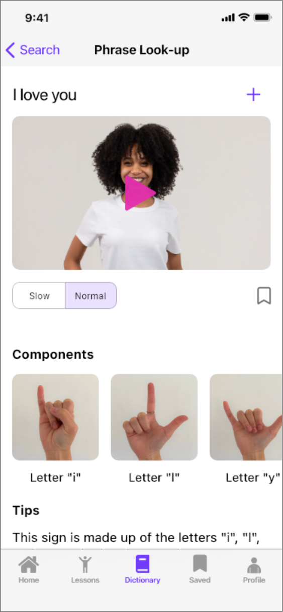

Changes
1. Save function - A Save icon was added underneath the demonstration video, and to give users easy access to their saved items, I changed the bottom navigation bar from 4 tabs to 5.
2. Camera button - The camera was originally to allow users to see themselves practicing the gestures, but many users mentioned that they didn't understand what it was supposed to do. I decided to remove it because it was more confusing than helpful.
3. Phrase outline - One user mentioned that the outline around the phrase at the top of the screen made it look like a text field. I removed the outline to enhance visual clarity.
4. Playback speeds - The majority of elements in the app are left-aligned. The playback speed buttons' position was adjusted to be consistent with the internal styling.
Final UI and Presentation Mock-ups
The presentation mock-ups give stakeholders and users a better idea of how the finished product will look and feel.
Thank you for viewing this project!
SignWise
By Caroline Arima