
Lessons in Eye-Catching Displays
Role: Designer, Artist
Duration: 3 years
Materials: Construction paper, Microsoft Office, pencil and paper
Background
One of my duties as an Assistant Language Teacher in Japan was creating interactive displays and signage geared towards learning English.
Here are 4 things I wish I'd known when I'd started making displays:
1. Keep it simple
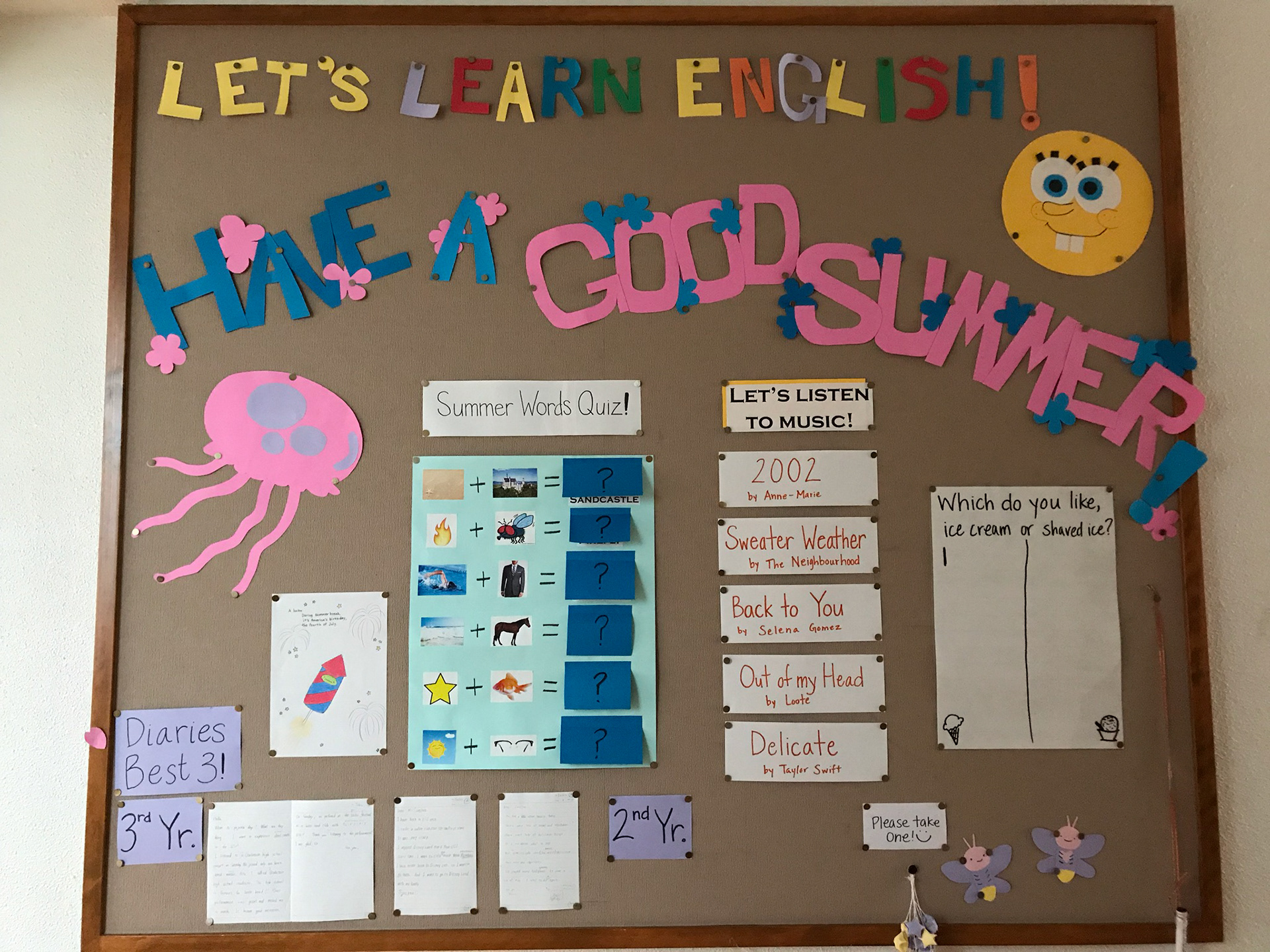
When I made my first display board, I was so excited. I had a thousand different ideas and didn't prioritize which visual elements would be the most important.
My early boards looked like this one below. No focal point, crowded, and the interactive elements were too small to be seen from afar.
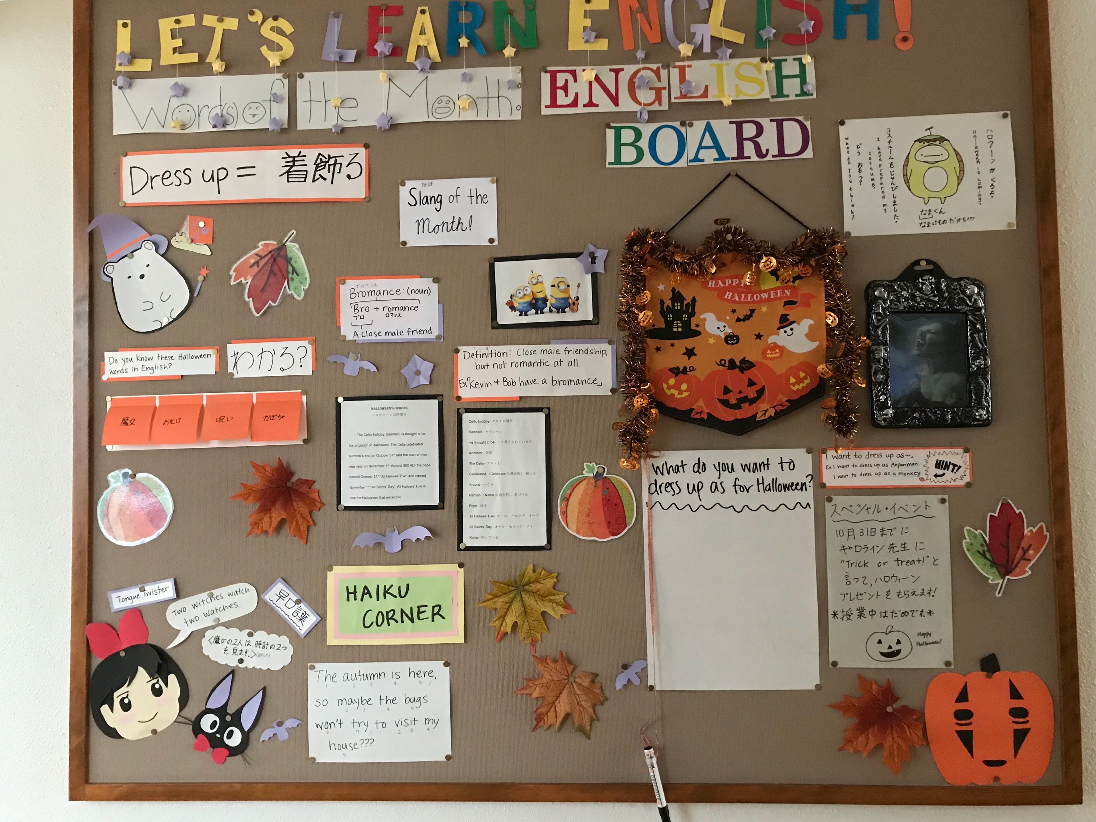
A very busy Halloween-themed English board
As I refined my planning and design process, I began creating simplified, visually unified displays that didn't sacrifice clarity for content.
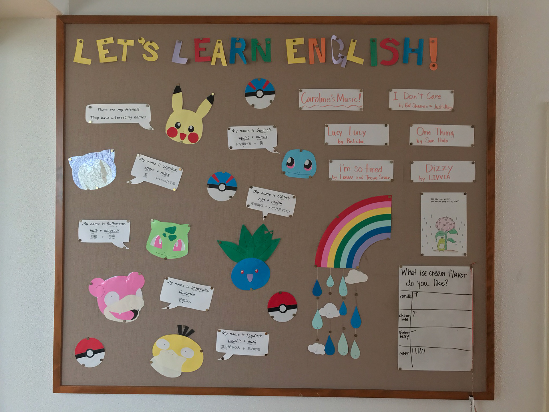
A Pokemon-inspired English board with simplified elements
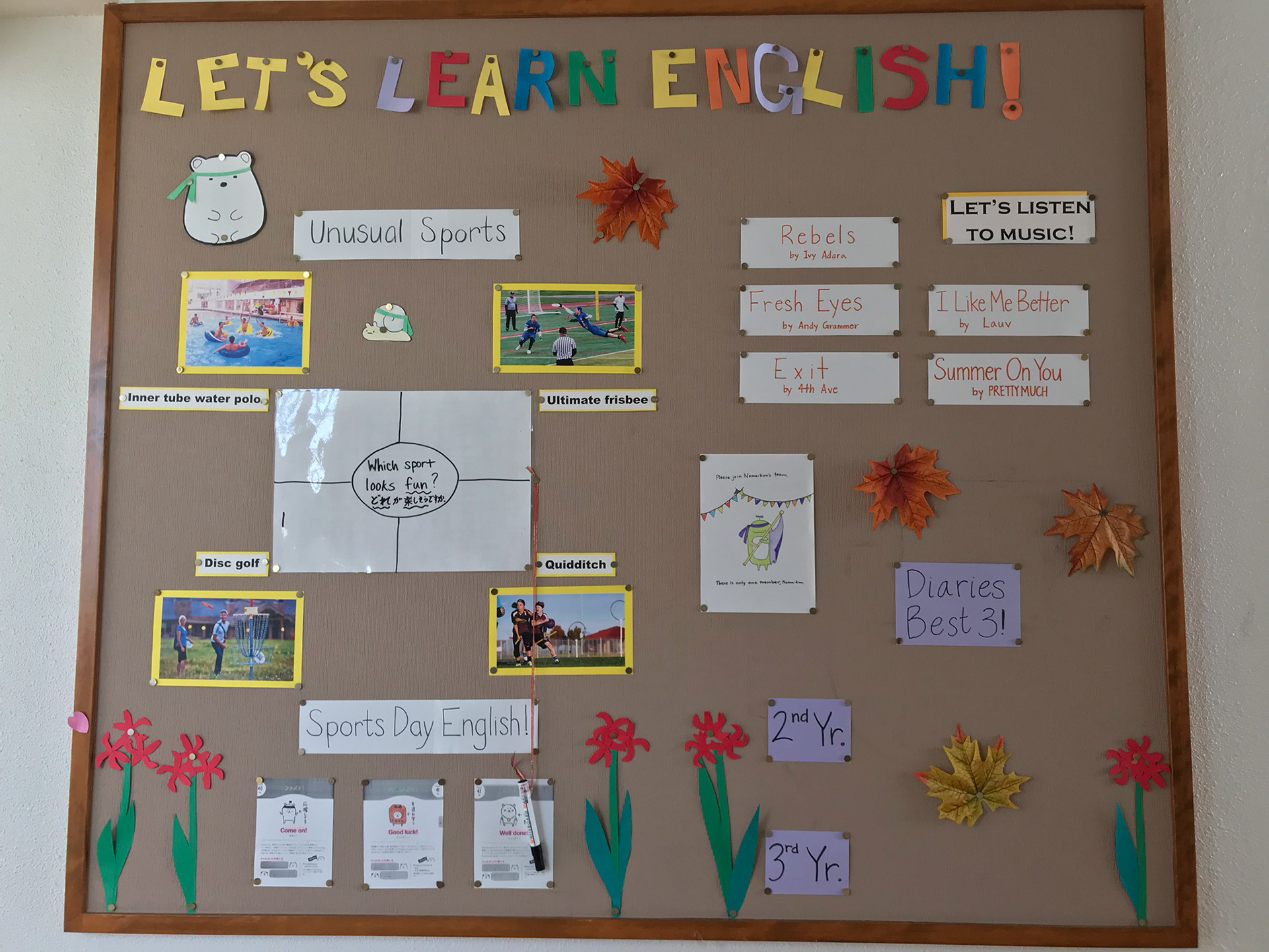
A Sports Day-themed display
2. Interactivity comes in different forms
Some of my students' favorite displays were ones that were highly interactive. I tried several different interaction methods such as polls, letters, and question boxes, but the most beloved was the English vocabulary staircase signage.
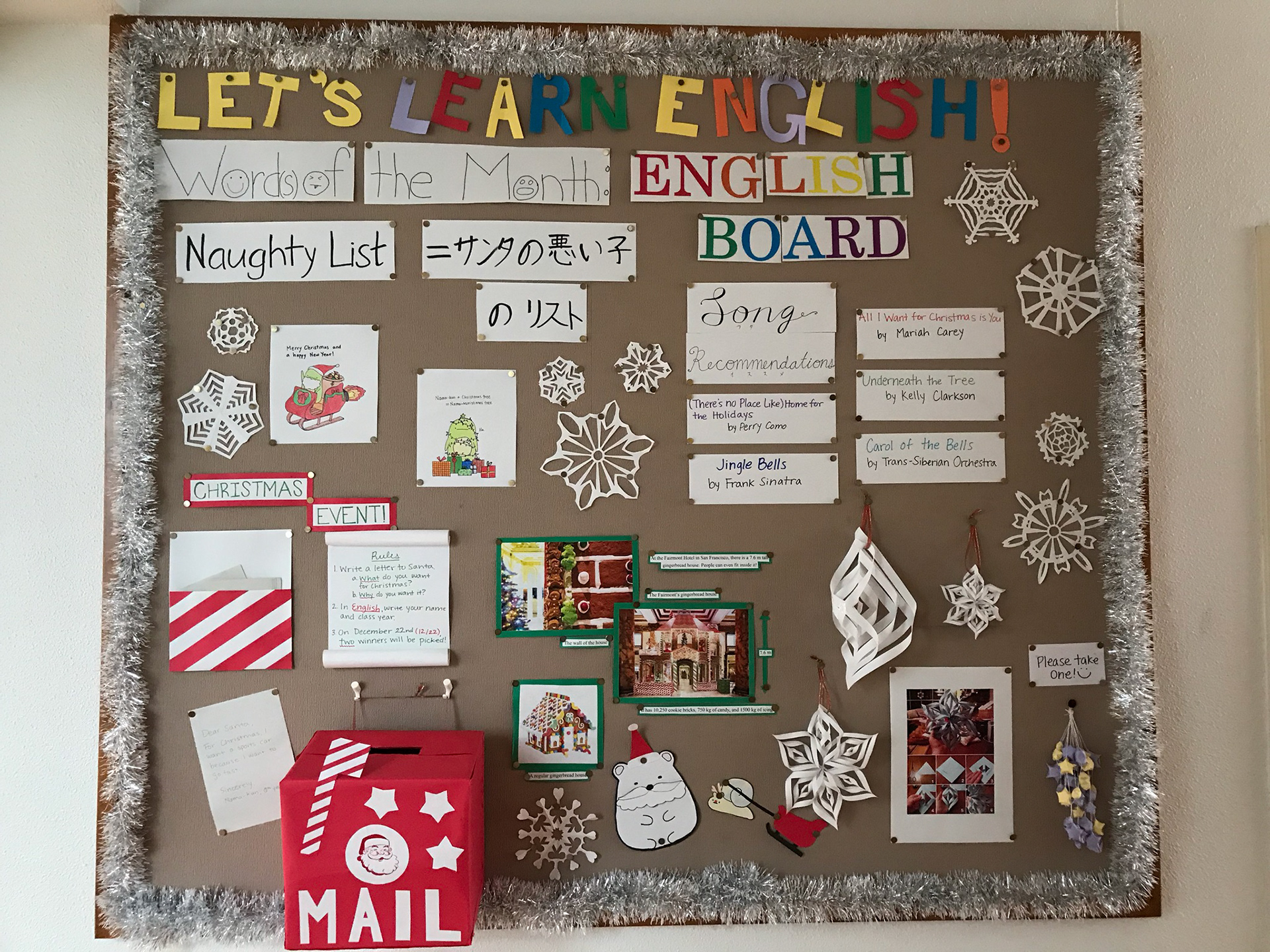
A Christmas-themed board with a Letters to Santa box
Even students who normally didn't like English class loved trying to pronounce their favorite colors, animals, and planets in English as they climbed the stairs! I found that multi-modal interaction was a powerful teaching tool in and out of classes.
Interactive color names staircase
Interactive solar system staircase
3. Catch their eye immediately
On average, a person will look at a billboard or other physical signage for about 6 seconds. Less, if it's a digital display.
That means your message has 6 seconds or less to grab the audience's attention.
To capture my students' attention and draw them in, I often used characters from popular media. Not only did students love seeing their favorite characters at school, they were also more willing to engage with English as a result.
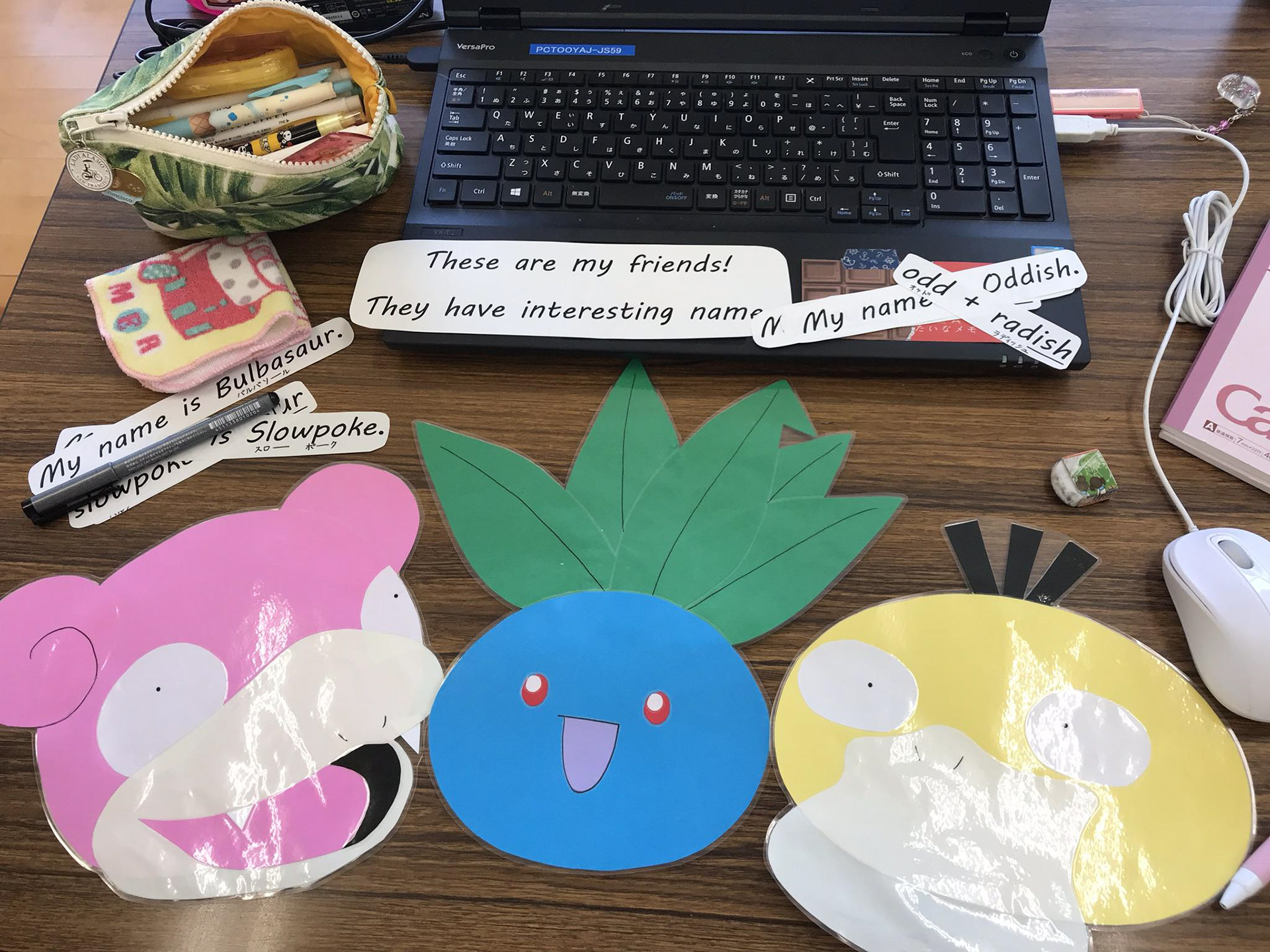
Slowpoke, Oddish, and Psyduck
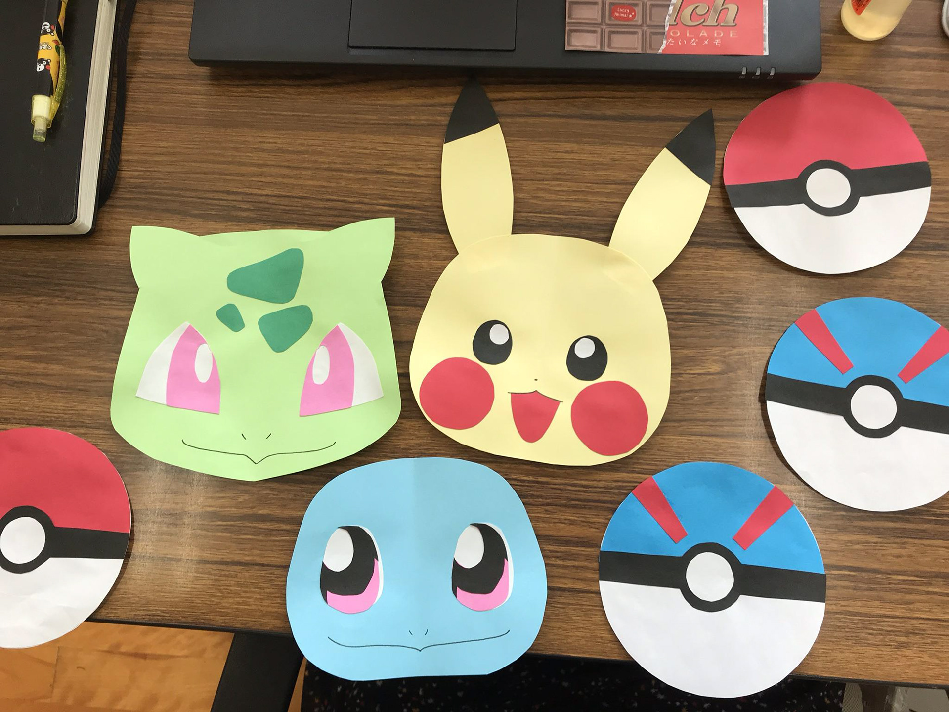
Bulbasaur, Pikachu, and Squirtle
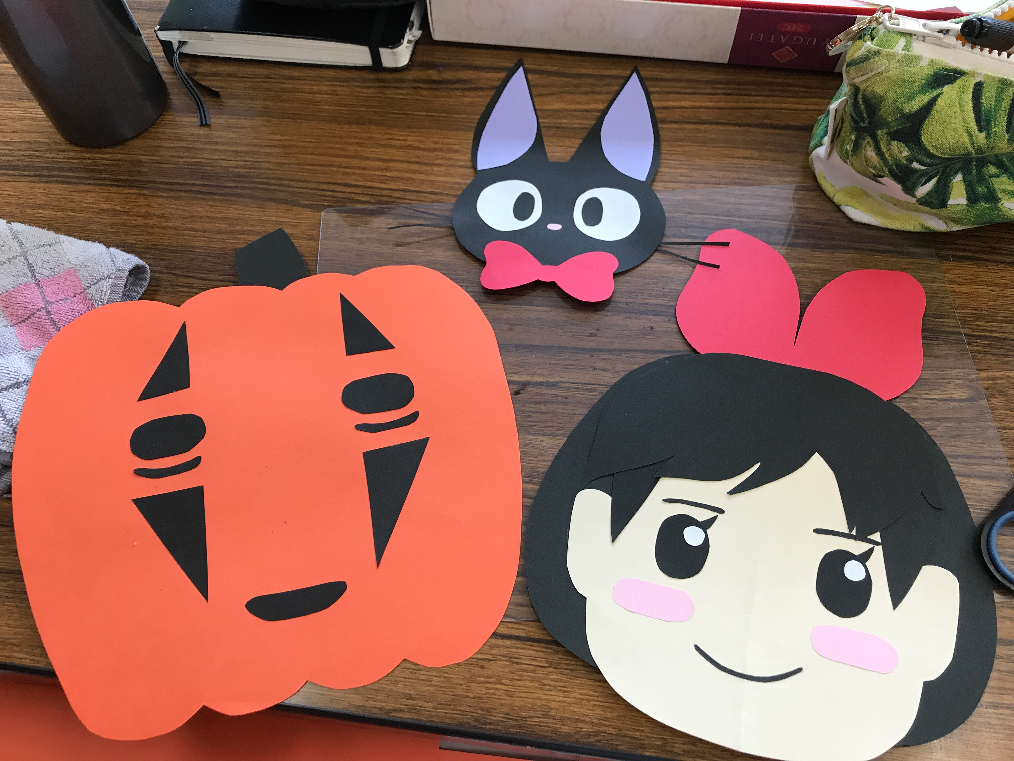
Three Studio Ghibli characters: Jiji, Kiki, and No Face reimagined as a pumpkin
4. Make main elements accessible
One of the mistakes I regret most was not making my display elements accessible. Students weren't stopping to look at the board because it wasn't capturing their attention or outright confusing them.
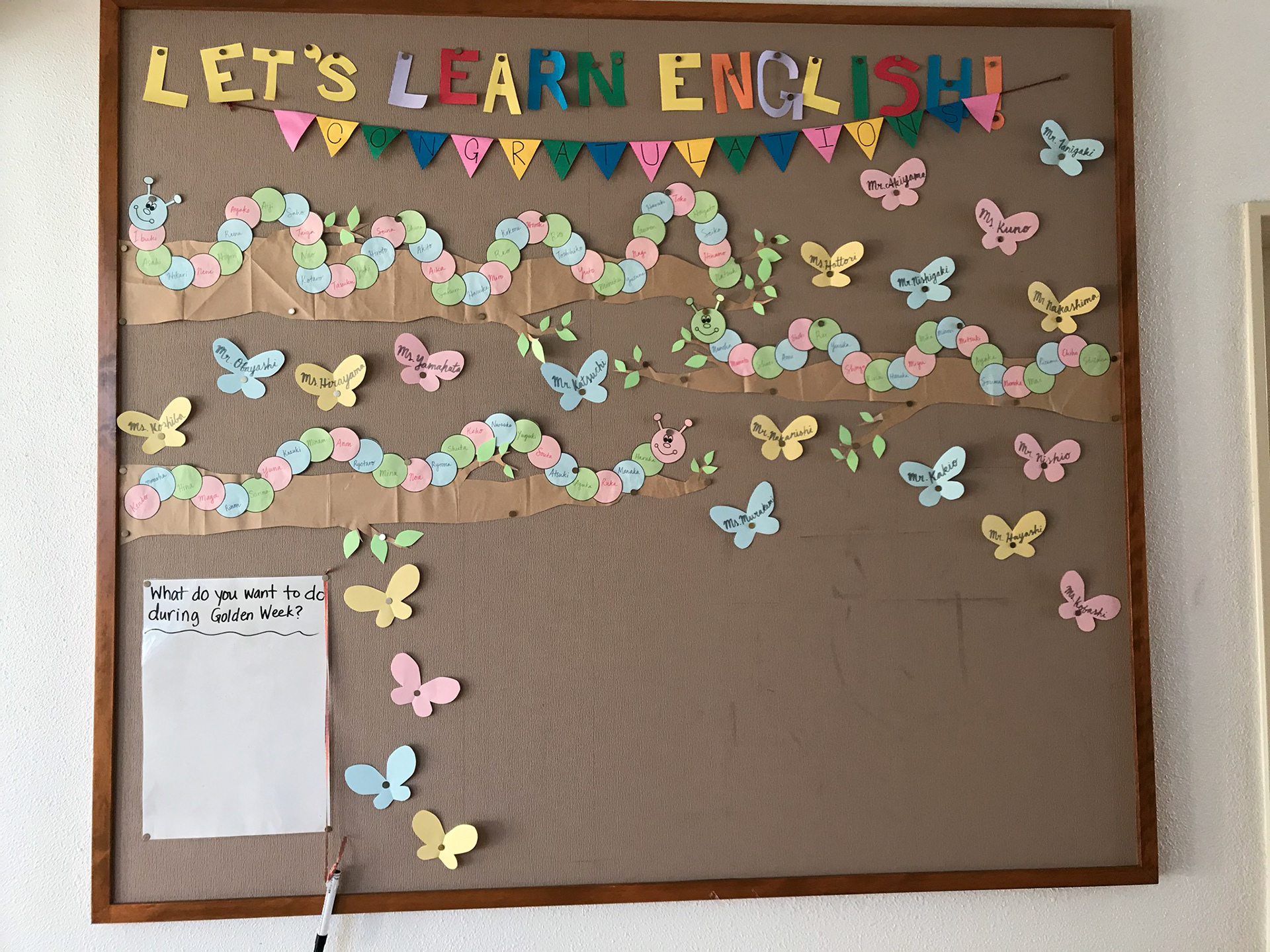
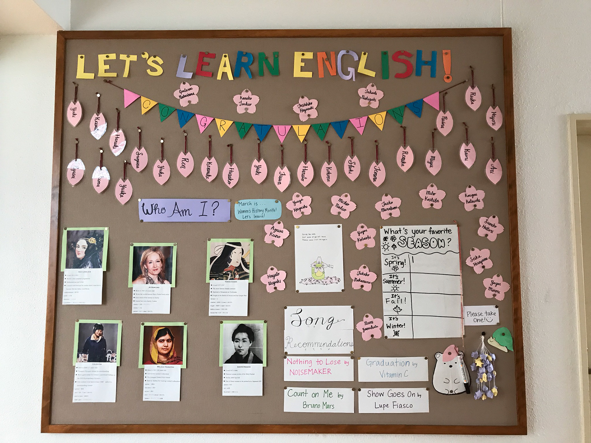
The displays above are perfect examples of the accessibility mistakes I made. The names on the caterpillars were too small and light, and the cursive names are difficult to read for beginning foreign language learners.
Reflection
Looking back, I realize how much I learned while working on these displays and how influential it was on my transition to UX/UI design. It taught me how to prioritize for visual clarity, imagine creative ways of interacting, and most importantly--consider my audience's needs.
Thanks for reading! If you liked what you saw, check out the gallery.
Disclaimer: I do not hold the licensing rights to any of the portrayed characters, nor do I make monetary gains from their image.