

CommunityShare
Design System
Role: Lead UI/UX Designer
Duration: 6 months
Tools: Figma, Google Sheets, pencil and paper
The Challenge
CommunityShare didn't have an established design system, making it slow and tedious to design new features and screens. It was also hard to know which components were currently in use and which were deprecated.
We needed to build a design system that could rapidly grow and scale with our organization as we expanded from 5 sites in the American Southwest into a nationwide platform while maintaining our brand identity.
The Process
To begin this massive undertaking, I took inventory of every component we were actively using as well as their states and variants.
See the Component Inventory Tracker here
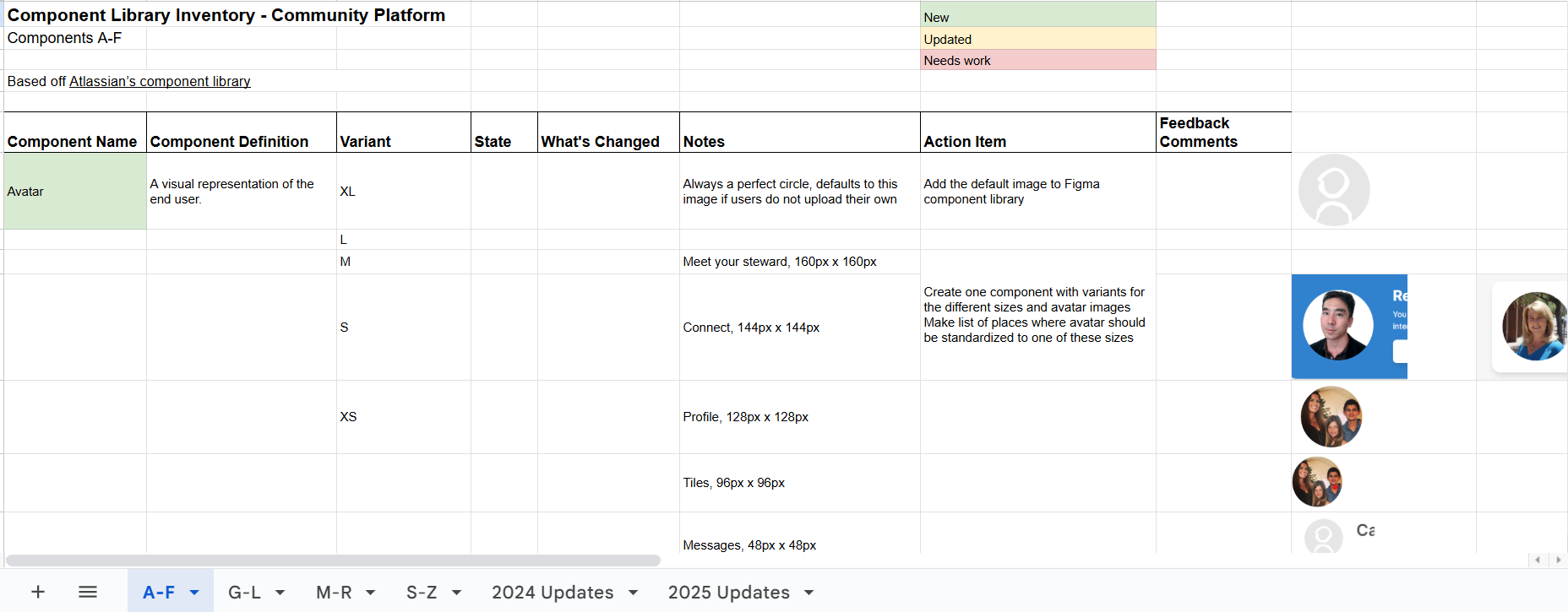
After cataloging, I gathered all the unusable or deprecated main components and figured out which components needed to be created.
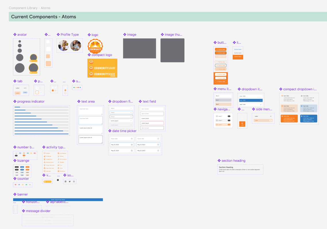
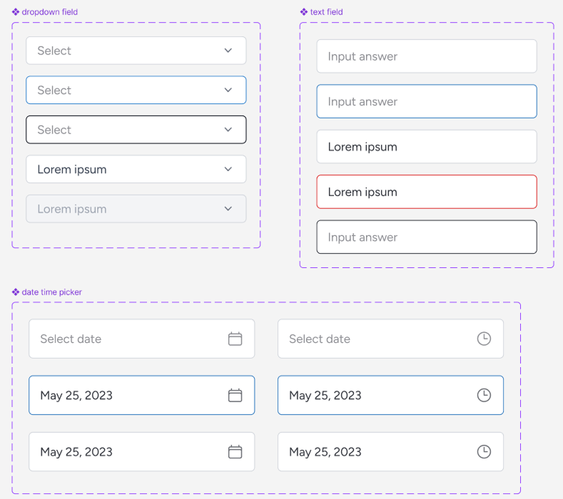
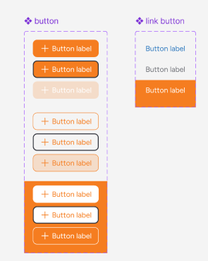
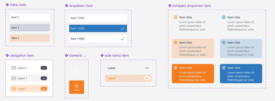
A snapshot of the Atoms section of the design system
Finally, in order to make this useful for future product team members, I published a style guide breaking down how all the pieces fit together. My primary goal was to explain the rules behind the design decisions so that it would be easy to create new on-brand components.
The First Iteration
The first iteration of the design system was far from perfect. It wasn't flexible enough to handle our organization's changing needs and that eventually led to our developer adopting Tailwind UI as a source of design truth.
The Second Iteration
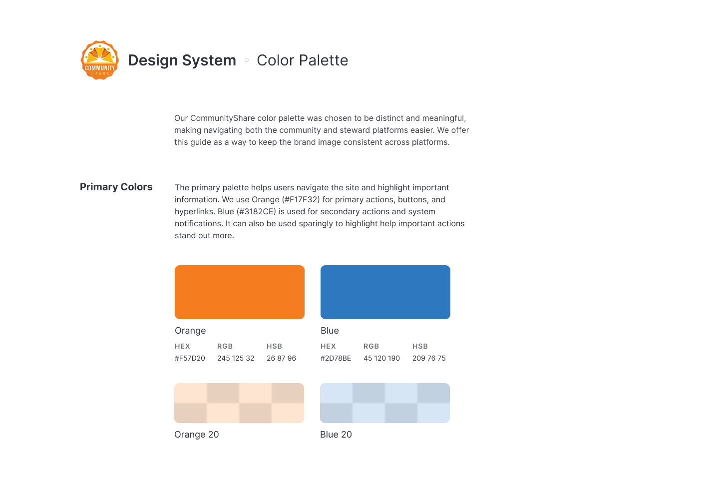
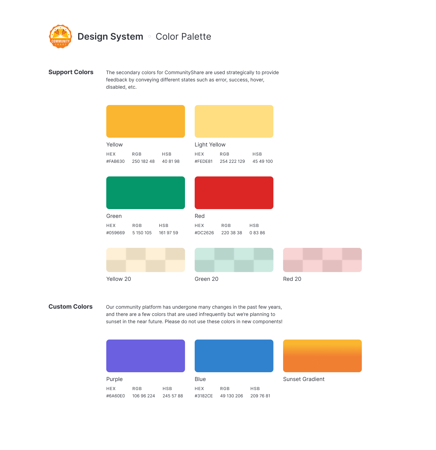
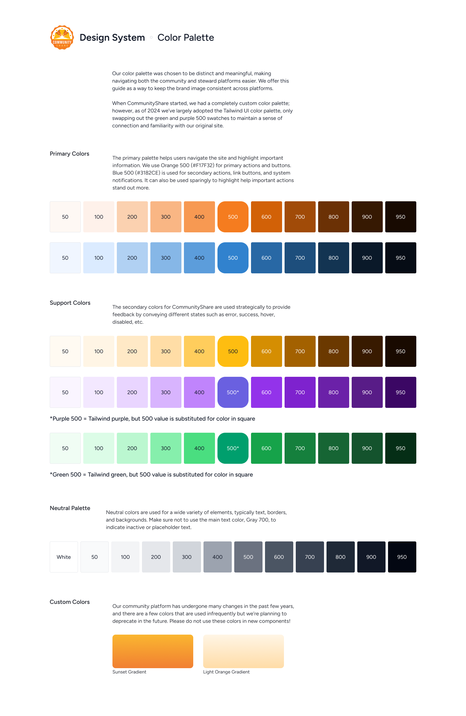
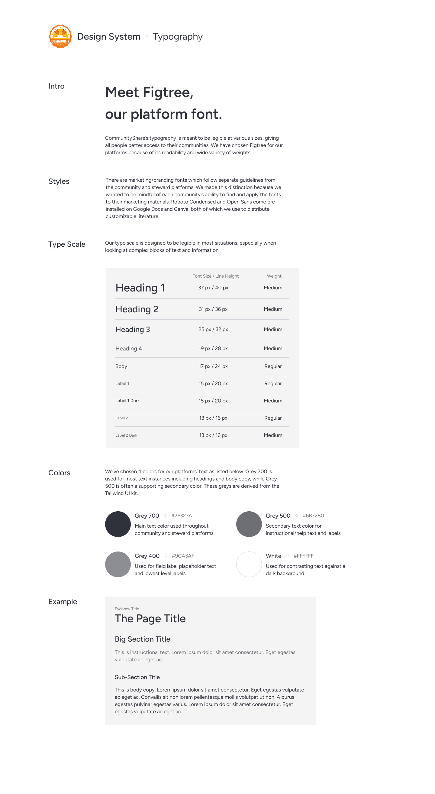
The second iteration incorporated a much wider color palette with room for some older custom colors. We also transitioned from Inter to a new system font, Figtree which had a friendlier, more modern feel.
I referenced other, more mature design systems such as Material Design and Atlassian to decide spacing, color usage, and usability rules.
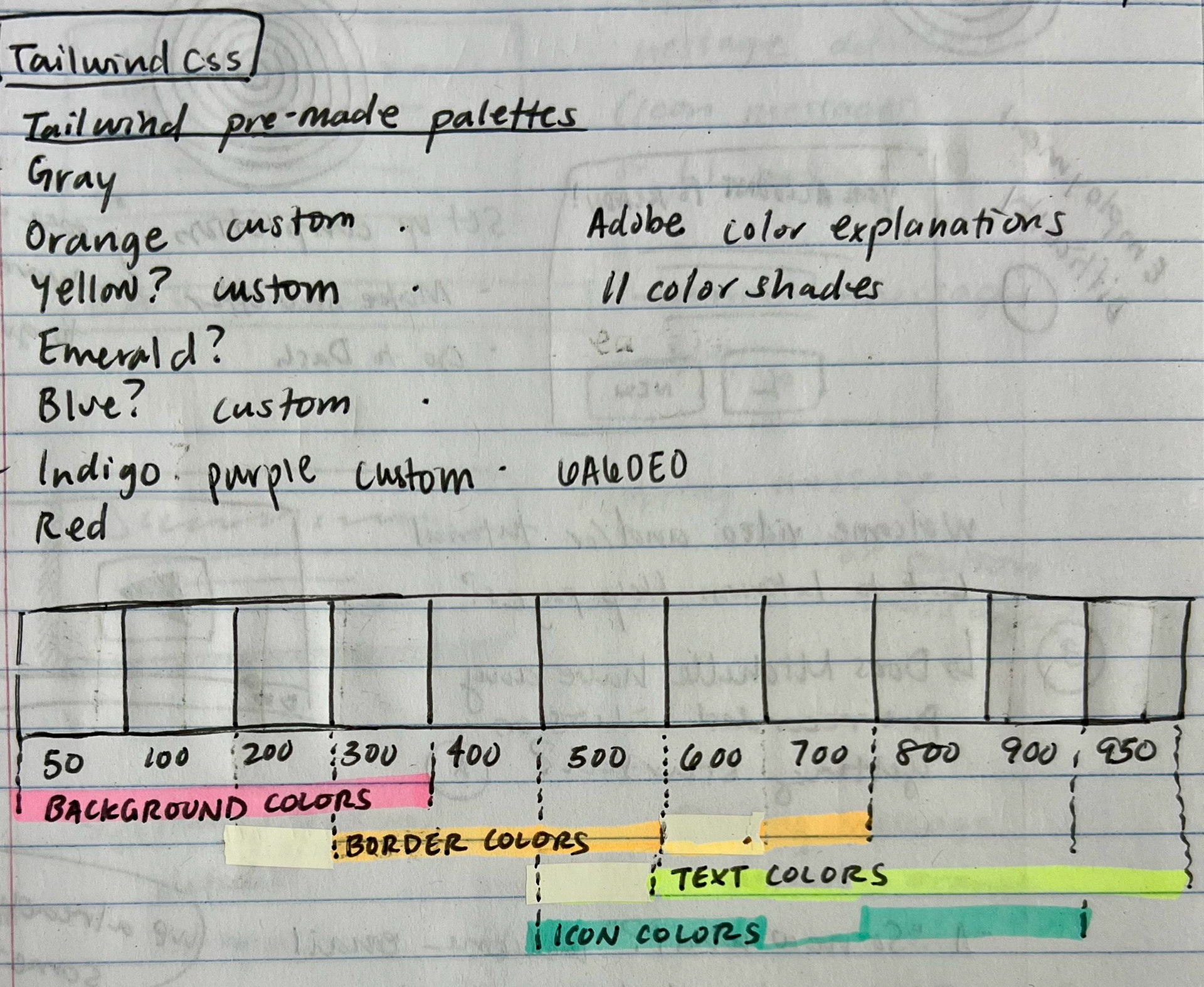
Some of my many scribbles while trying to nail down the color palette!
Reflection
This project spanned months, taking many iterations and hours of work. I learned a lot about design systems during this time and if I would do it again there are a couple of things I would change.
1. Move components for our administrative platform to a separate design system. These components didn't match the community platform's visual design and were difficult to maintain in the same document.
2. Separate the mobile components from the desktop components. At the time, we knew we didn't have many mobile users and deliberately chose not to prioritize these components. However, in the evolving digital landscape, this was not a sustainable way to maintain the design system. Mobile components look and often function differently than their desktop counterparts, so I would separate them into a separate design library if I could.

Thank you for taking the time to read!