

Tools used: pencil and paper, Inkscape
Role: Graphic designer and client
About My Logo
A logo doesn't have to be flashy or complicated to be memorable. In fact, some of the best ones aren't. McDonald's, Pepsi, Instagram--they all have relatively simple logos. I designed my own logo with this in mind, something simple that represented who I am as an artist and as a person.
I've always been drawn to geometric and repeating patterns as an artist, so this was a fun way to experiment with digital pattern-making.
The original color palette I chose several years ago felt like it wasn't cohesive enough so I used the Coolors color palette generator for several ideas.
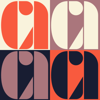
Original color palette: orange, navy, cream, and dusty pink
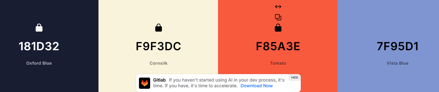
Ok...a lot of ideas!
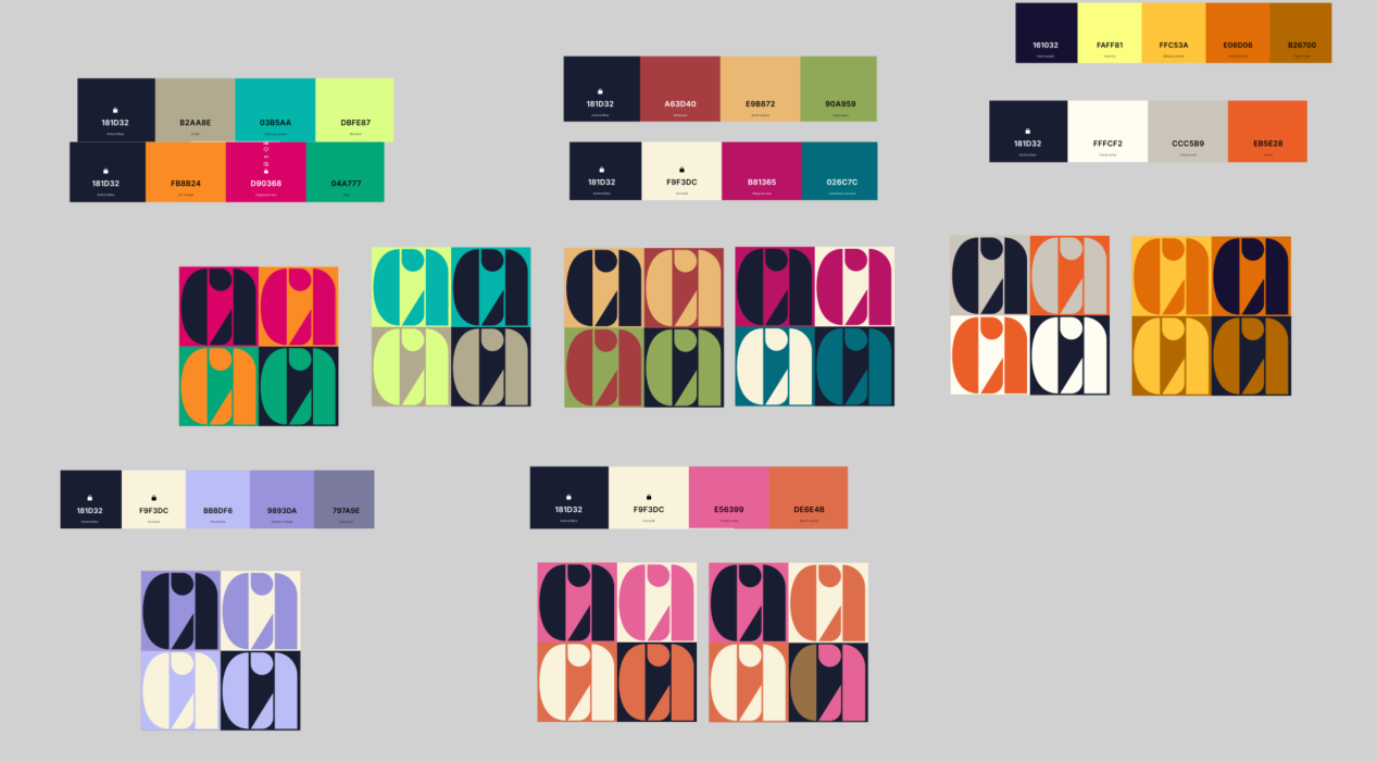
A screenshot of all the swatches I tried
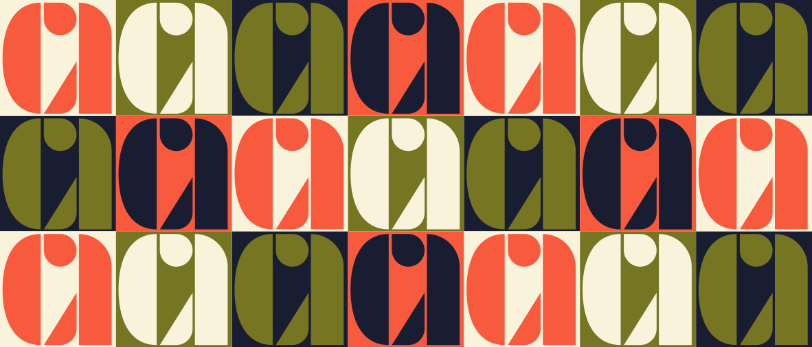
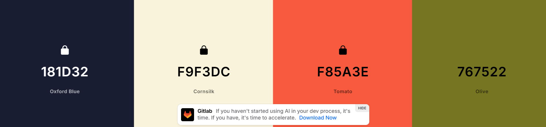
A larger sample of a color combination I liked--navy, orange, moss green, and cream
In generating so many different palettes I realized I gave myself analysis paralysis, so it was time for some reflection. How was I actually going to apply this pattern? With a use case in mind, it was much easier to select a color palette that fit the situation.
After some consideration, I decided that I wanted this pattern as a cover photo for my Linkedin profile.
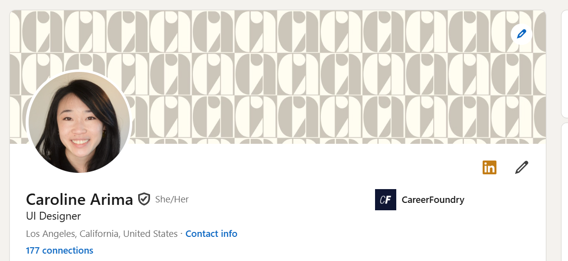
A screenshot of my Linkedin profile cover photo
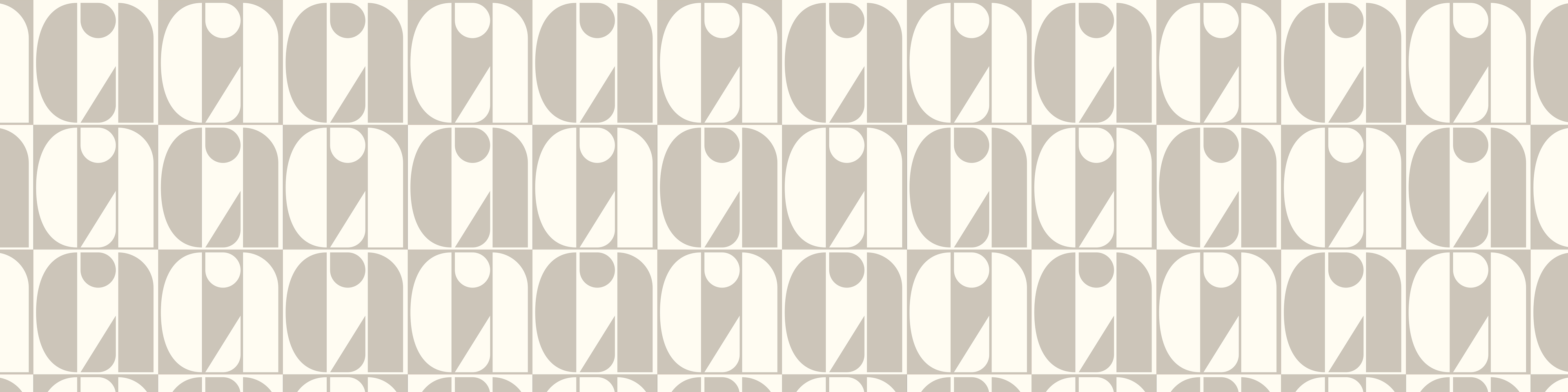
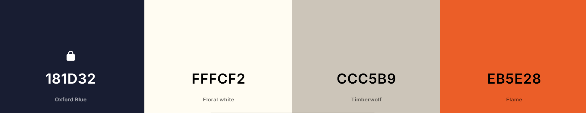
The neutral logo pattern--cream and tan
I opted for a very neutral, toned-down color palette of tan and cream because I wanted the pattern to enhance, rather than distract, from the profile information listed below it.
Maybe in the coming years, I'll try a new palette to reflect the person I've become!
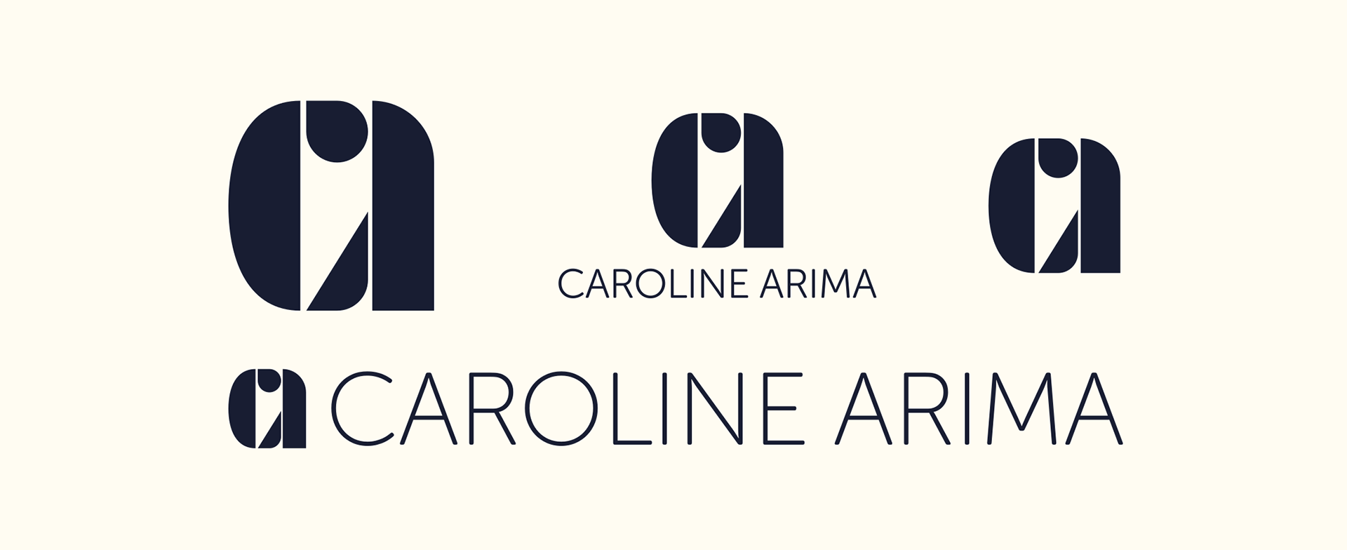
Variations on my logo
Thanks for reading. Like what you saw? Check out my gallery.