View the prototype here
Role: UI/UX Designer and Researcher
Tools used: Adobe Illustrator, Adobe XD
Project Duration: 1 month
Context
As part of my CareerFoundry coursework, I was asked to create a fintech tool in order to help people save money quickly in preparation for a big purchase such as a house or a car.
Objective
There is an outsized misconception that millennials spend their money frivolously on things like avocado toast instead of saving up for homes or new cars. And though I don't believe this statement, it got me thinking about how I could make planning out a savings goal easier.
Sketches and User Flow Diagram
Early in the design process, I created a user flow diagram from three potential user journeys. I spent a while researching and comparing fintech apps to gather ideas for the layout before I moved on to sketching ideas.
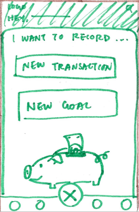
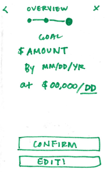
Based on my research and the user flow diagram, I chose one user flow (User Flow #3) to flesh out, first on paper, and later, on Adobe XD. Though not all my sketches are pictured here, I used the Crazy 8s method of rapid sketching to ideate solutions.
User Flows
1. As a money saver, I need to be able to input information on the money I am receiving and spending so that I can see an overview of my finances.
2. As a user, I want to see a dashboard of my finances clearly and visually represented so that I can see how much I am spending on what at a glance.
1. As a user, I need to be able to tell the tool what my savings goal is and how long I have to reach it so that I can save accordingly.
User Flow #3 Sketches

Home
Create a New Goal (Modal)

Input Goal Information 1

Input Goal Information 2
Goal Summary
Brand Guidelines
I put together a set of brand guidelines for Avocado so that anyone working on this would be able to present a consistent, reliable product to the user. These guidelines include topics such as principles, writing style, and colors to use.
Avocado's Guiding Principles
Motivating
Avocado is friendly and encouraging. Good savings habits aren't built overnight, so we want to prepare users for a marathon, not a sprint.
Independent
We give users the tools to attain financial independence so that they can achieve the lifestyles they want.
Accessible
Avocado believes financial knowledge should be freely accessible. All peoples deserve to have access to information that can better their lives.
Honest
You can depend on Avocado to never sugarcoat the truth and always tell it to you straight. We believe that this kind of honesty builds trust.
Writing Style
Avocado's guiding principles extend beyond the app's interface. We apply these guidelines to the way we write as well. Our writing is the foundation of communication with our users, so when writing for Avocado keep these guidelines in mind:
1. Speak positively
Users come to us for help on saving money and figuring out how to manage their finances. Thus, we speak with an encouraging, collected voice as a mentor or friend would. Avoid using exclamation marks in headings or body copy.
2. Speak plainly
No corporate jargon, swearing, or slang. Contractions are fine, but avoid acronyms such as "btw" and "fyi". Explanations should be understandable to the average person without a background in finance.
3. Keep labels concise
This applies to buttons, headlines, form fields, and so on. Keep labels down to one or two words. For example, instead of "Log into my account", limit button text to "Login".
4. Punctuation is key
We're strong proponents of the Oxford comma here and we always use sentence case and proper punctuation in copy. Remember: "Let's eat, Grandma!" and "Let's eat Grandma!" are two very different concepts. We also don't use periods at the end of headlines, but always make them all-caps to be clear.
Colors
Primary colors

HEX: #8FE47A / RGB: 133, 228, 122 / HSB: 114, 46, 89

HEX: #FFFFFF / RGB: 255, 255, 255 / HSB: 0, 0, 100
Secondary Colors

HEX: #34D222 / RGB: 52, 210, 34 / HSB: 114, 84, 82

HEX: #FFFA72 / RGB: 255, 250, 114 / HSB: 58, 55, 100

HEX: #FF5A5A / RGB: 255, 90, 90 / HSB: 360, 65, 100

HEX: #CACACA / RGB: 202, 202, 202 / HSB: 114, 0, 79
The primary colors were chosen to fit the app's theme of financial security and reliability. I chose the secondary colors based on their visibility against the primary colors.
Usability Testing
I interviewed three subjects between 24-30 years of age, gathered their feedback, and ranked the usability issues that came up during testing using Jakob Nielson's error severity scale.
"It's more important for me to know 'If I save $X amount per week, then it will take me Y weeks to save for my goal."
Results Synthesis & Error Ratings
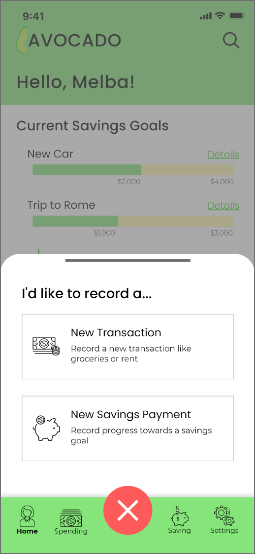
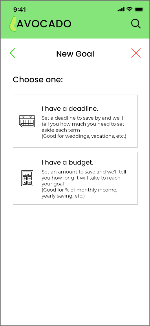
Because multiple users mentioned that they didn't understand what the center button did on the bottom navigation bar, I changed its function in the app. Users are now able to record transactions easily and they can still set a new savings goal by selecting the Savings tab.
Logo Creation
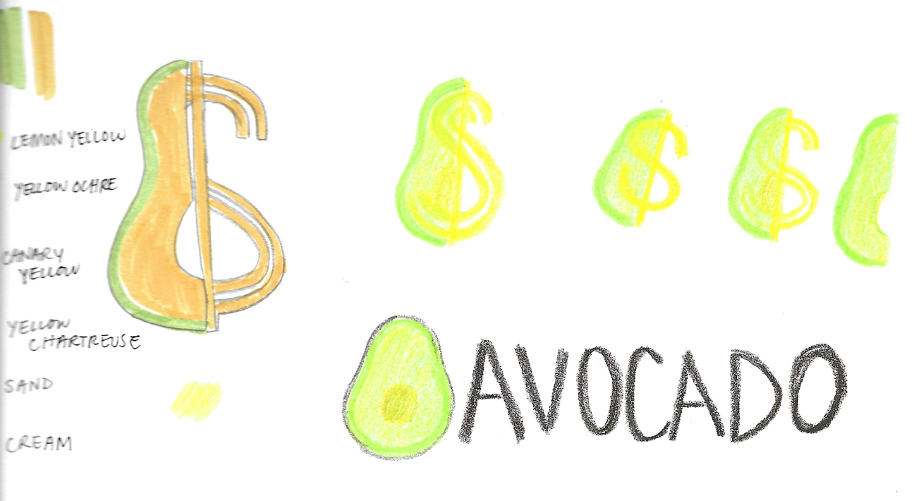
I wanted to challenge myself to make a custom logo in Adobe Illustrator for this project because I had never made one before and I also wanted Avocado to feel unique from my other projects. After spending some time sketching logo ideas on paper, I transitioned to the computer for the final version.


Final UI
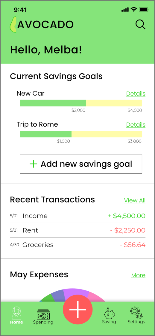
Home

Record a New Goal Version 2

New Goal Part 1
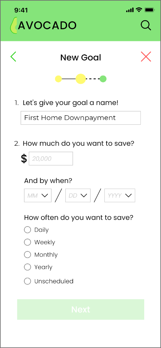
New Goal Part 2

New Goal Part 3

Goal Summary
Thank you for viewing!